Screen Tour of IntelliDealer
-
Always use the Close button when exiting a pop-out screen or module. Using the X button at the top right of the window may cause unexpected behavior. See Required Restarts.
-
The home button
 takes you to the home page from wherever you are in the system.
 -
The
 icon in the top left collapses the left menu into a series of icons to provide more room on screen.
 -
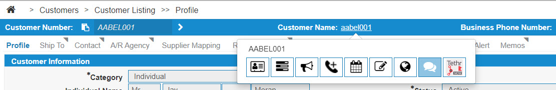
There is a hover-over menu that can be opened by holding your cursor over the Customer Name. It allows you to open that customer's profile to add a call, add a note, and many other features.
-
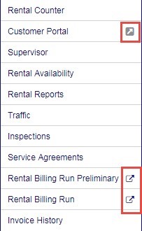
In the menu system there are pop out menus. Here is the Product Support Rental menu as an example:
-
For the Customer Portal, the
 indicates you have a choice. If you click the words "Customer Portal" the portal opens in the main window. However, if you click the icon the Portal opens as a separate window.
 -
The
 icon (beside the billing runs for example) indicates that these windows automatically pop up as a separate window.
-
-
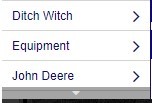
Menus that open into long lists have a grey pull-down arrow that allows you to scroll down, either by clicking the gray bar with the arrow, or by using the scroll wheel on the mouse:
-
Printer Output and PDF Viewer options are located under the
 icon at the top right-hand side of the screen.
 -
New color schemes are available by location. From Administration > Settings > System, under the Theme dropdown list, you may select a color theme. Select a color, then click Save and log out. The color option is applied when you log back in.
-
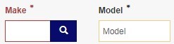
Fields interact with user inputs. A yellow highlight means the user has modified the field since the screen was originally loaded. A red highlight means the field has an error or problem which needs to be corrected. Here is an example from equipment profile:
-
To select and change columns that appear. Click the box beside the columns you want to see. The print screen below is from equipment profile listing as an example.
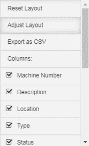
Use the Adjust Layout option and drag and drop columns to position them as needed. Use the Reset Layout option to go back to the default configuration.
In listing screens, the
icon opens a sub-menu with the option to Export as CSV. -
The columns in the Header Row can be sorted from ascending to descending using the
 arrow icons.
 Descending
  Ascending
 -
The Header Row of some listing screens appear by default with a priority sort next to the column heading.

In this image, the columns are numbered in the order they appear in the listing screen.
-
A message notification system lets users know when they have a new unread message. The numeric badge next to the envelope icon displays the number of new, unread messages.
When you receive a message while signed in, you see the message as a prompt in the top right corner of the screen:

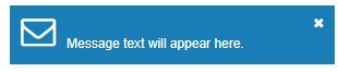 This prompt appears again if the message is still unread and continues until the message is opened.
 -
Informational messages can appear in the top left of the window after you have performed an action. Green messages indicate a successful action, such as making a deposit. Red messages with a warning icon indicate an unsuccessful action. For example, if you try to edit a work order that is in use, a red message appears listing the work order number and the name and profile ID of the user that is accessing it.
-
The top of the screen displays the path (referred to as breadcrumbs) for your current screen. You can click these options at the top to expand the menus in each section instead of going back to the main menu in the left panel.

-
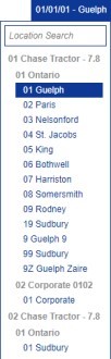
The Location setting found near the top right can be expanded to open the Location Search window. You can change locations at any time, or manually search for specific locations.
Revision: 2026.01